基本的なHTML
基本的なHTMLは下記になります。figureでマークアップしてみました。
<section class="sample1"> <figure> <img src="thum01.jpg" width="400" height="266"> <figcaption class="title">Hover Effect 01</figcaption> </figure></section>figureのCSSは「overflow: hidden」ではみ出ないようにしています。
section figure { width: 400px; height: 266px; margin: 0 auto; position: relative; overflow: hidden; background: #000;}1.画像を縮小しつつ下からにょきっと出るキャプション
最初はすごく簡単なやつです。
通常の状態はtranslateYで画像外に飛ばしておいて、hover時に0で表示させてアニメーションしています。
transitionの4つ目のパラメータでディレイ(時間差)を調節できます。
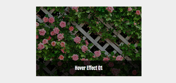
.sample1 img { transition: all 0.4s ease-out 0.1s;}.sample1 figure:hover img { opacity: .6; transform: scale(1.3);}.sample1 figcaption { color: #fff; background: #333; background: rgba(0,0,0,.7); position: absolute; bottom: 0; width: 100%; height: 60px; padding: 20px; line-height: 1;
/* 1行で納める */ overflow: hidden; text-overflow: ellipsis; white-space: nowrap;
transition: all 0.2s ease-in 0.3s; transform: translateY(60px);}.sample1 figure:hover figcaption { transform: translateY(0);}2.キャプションが横にスライドして画像が押し出される
やってることは先ほどとあまり変わりませんが画像・キャプションともtranslateXを動かして押し出されるような感じにしております。
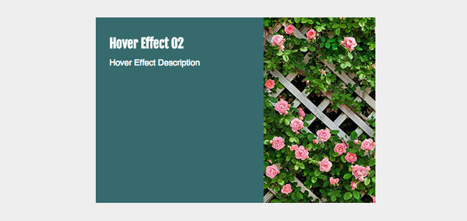
.sample2 figcaption { position: absolute; height: 100%; width: 240px; background: #366a6d; top: 0; display: block; text-align: left; padding: 20px; color: #fff; transform: translateX(-240px); transition: all .5s ease-out;}.sample2 figure:hover figcaption { transform: translateX(0);}.sample2 figure img { left: 0; position: absolute; transition: all .5s ease-out;}.sample2 figure:hover img { transform: translateX(100px);}3.外から枠がぐいってなる
外から枠がぐいって出てきます。
枠はafterに設定してます。あとはscaleで縮小です。比率とかが結構適当です。。。
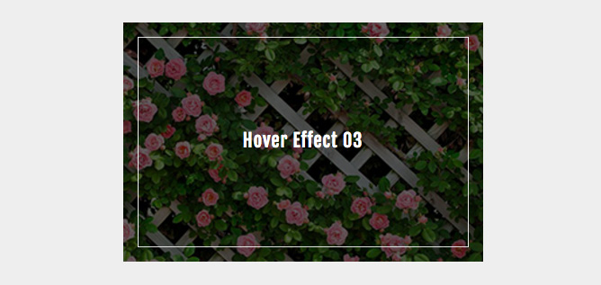
.sample3 { color: #fff;}.sample3 figure:after { position: absolute; border: solid 1px #fff; content: ""; display: block; width: 100%; height: 100%; left: 0; top: 0; opacity: 0; transform: scale(1.0, 1.0); transition: all .3s ease-out;}.sample3 figure:hover:after { opacity: 1; transform: scale(0.92, 0.88);}.sample3 figcaption { position: absolute; width: 100%; top: 50%; left: 0; margin-top: -1em; font-size: 20px; letter-spacing: 5px; opacity: 0; transition: all .3s ease-out .2s;}.sample3 figure:hover figcaption { letter-spacing: 1px; opacity: 1;}.sample3 figure img { transition: all .8s ease-out;}.sample3 figure:hover img { opacity: .4; transform: scale(1.3);}4.中心線が真ん中からスーっと出る
中心線はafterに設定してます。今度はscaleで拡大です。
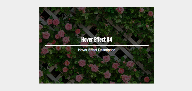
.sample4 { color: #fff;}.sample4 figure:after { position: absolute; background: #fff; content: ""; display: block; width: 90%; height: 1px; left: 5%; top: 50%; transform: scale(0); transition: all .9s ease-out;}.sample4 figure:hover:after { transform: scale(1);}.sample4 figcaption p,.sample4 figcaption h3 { position: absolute; text-align: center; width: 100%; opacity: 0; transition: all .4s ease-out .4s;}.sample4 figcaption h3 { bottom: 51%; transform: translateY(-30px);}.sample4 figcaption p { top: 52%; transform: translateY(30px);}.sample4 figure:hover figcaption p,.sample4 figure:hover figcaption h3 { opacity: 1; transform: translateY(0);}
.sample4 figure img { transition: all 1.2s ease-out;}.sample4 figure:hover img { opacity: .4; transform: scale(1.3);}}5.ソーシャルボタンがぴょんぴょんぴょん
ディレイを駆使してソーシャルボタンを時間差でアニメーションさせて表示してみませましょう。
アイコンの位置とか適当です。。。
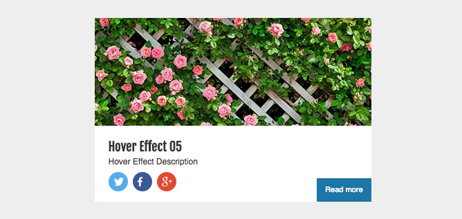
<section class="sample5"> <figure> <img src="thum01.jpg" width="400" height="266" class="thumb"> <figcaption> <h3 class="title">Hover Effect 05</h3> <p>Hover Effect Description</p> <a href="#" class="more-btn">Read more</a>
<ul class="sns-btns"> <li class="twitter"><a href="#"><img src="twitter.svg"></a></li> <li class="facebook"><a href="#"><img src="facebook.svg"></a></li> <li class="google"><a href="#"><img src="gplus.svg"></a></li> </ul> </figcaption> </figure></section>.sample5 a { color: #333;}.sample5 figcaption { position: absolute; height: 80px; width: 100%; background: #fff; bottom: 0; display: block; text-align: left; padding: 20px; color: #333; transition: all .3s ease-out .2s;}.sample5 figure:hover figcaption { height: 110px; transition-delay: 0s;}.sample5 figcaption h3 { margin-bottom: 0; line-height: 1.2;}.sample5 figure img.thumb { top: 0; left: 0; position: absolute; transition: all .3s ease-out .2s;}.sample5 figure:hover img.thumb { top: -20px; transition-delay: 0s;}.sample5 figcaption a.more-btn { font-size: 11px; color: #fff; background: #1d76a6; padding: 7px 12px; position: absolute; right: 0; bottom: 0; transform: translateX(90px); transition: all .2s ease-out;}.sample5 figcaption a.more-btn:hover { background: #2a9cc0;}.sample5 figure:hover figcaption a.more-btn { transform: translateX(0); transition-delay: .4s;}.sample5 figcaption ul.sns-btns { list-style: none; position: relative; padding-top: 4px;}.sample5 figcaption ul.sns-btns li { padding: 7px; line-height: 1; height: 28px; width: 28px; float: left; background: #3b5998; border-radius: 50%; position: absolute; transform: translateY(50px); transition: all .15s ease-out;}.sample5 figure:hover figcaption ul.sns-btns li { transform: translateY(0);}.sample5 figcaption ul.sns-btns li.twitter { background: #55acee; padding: 8px; transition-delay: .4s;}.sample5 figcaption ul.sns-btns li.facebook { background: #3b5998; left: 35px; transition-delay: .2s;}.sample5 figcaption ul.sns-btns li.google { background: #df4a32; left: 70px; transition-delay: 0s;}.sample5 figure:hover figcaption ul.sns-btns li.twitter { transition-delay: 0s;}.sample5 figure:hover figcaption ul.sns-btns li.facebook { transition-delay: .2s;}.sample5 figure:hover figcaption ul.sns-btns li.google { transition-delay: .4s;}.sample5 figcaption ul.sns-btns li img { height: 100%; vertical-align: top;}