See the Pen Circle Drawermenu by webopixel (@webopixel) on CodePen.
HTML
メニューのトグルとなるボタンと、メニュー本体があります。
今回はメニューと円の部分は別々にアニメーションしたかったので、別の要素にしたほうが簡単です。
index.html
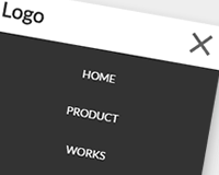
<div id="nav-toggle">
<div>
	<span></span>
	<span></span>
	<span></span>
</div>
</div>

<div id="nav-circle-bg"></div>
<nav id="nav">
<ul>
	<li><a href="#">HOME</a></li>
	<li><a href="#">ABOUT</a></li>
	<li><a href="#">WORKS</a></li>
	<li><a href="#">CONTACT</a></li>
</ul>
</nav>
JavaScript
JavaScriptはbodyにopenクラスを切り替えるだけです。
JavaScript
<script src="http://ajax.googleapis.com/ajax/libs/jquery/1.12.3/jquery.min.js"></script>
<script type="text/javascript">
(function($) {
	$(function() {
		$('#nav-toggle').on('click', function() {
			$('body').toggleClass('open');
		});
	});
})(jQuery);
</script>
CSS
拡大するときはscaleだと荒くなってしまうので、matrixを使用するといい感じなようです。
CSS
/* ========================
* Navigation Circle BG
* ======================== */
#nav-circle-bg {
	position: fixed;
	background: #fff;
	width: 600px;
	height: 600px;
	top: 50%;
	right: -600px;
	margin-top: -300px;
	border-radius: 50%;
	transition: transform .5s ease;
	transition-delay: .6s;
}
.open #nav-circle-bg {
	transform: matrix(2.7, 0, 0, 2.7, 0, 0);
	transition-delay: 0s;
}

/* ========================
* Navigation
* ======================== */
#nav {
	position: fixed;
	font-size: 32px;
	height: 100%;
	width: 500px;
	right: -500px;
	display: flex;
	align-items: center;
}

#nav ul {
	width: 100%;
	list-style: none;
}

/* ========================
* Navigation Animation
* ======================== */
#nav li {
	transition: transform .5s ease;
	transition-delay: 0;
}
#nav li:nth-child(1) {
	transition-delay: 0;
}
#nav li:nth-child(2) {
	transition-delay: .1s;
}
#nav li:nth-child(3) {
	transition-delay: .2s;
}
#nav li:nth-child(4) {
	transition-delay: .3s;
}

.open #nav li {
	transform: translateX(-400px);
}
.open #nav li:nth-child(1) {
	transition-delay: .3s;
}
.open #nav li:nth-child(2) {
	transition-delay: .4s;
}
.open #nav li:nth-child(3) {
	transition-delay: .5s;
}
.open #nav li:nth-child(4) {
	transition-delay: .6s;
}

/* ========================
* Navigation Button
* ======================== */
#nav a {
	width: 100%;
	display: block;
	color: #333;
	text-decoration: none;
	padding: 10px 0;
}
#nav a:after {
	content: "";
	display: block;
	background: #D32222;
	width: 0;
	height: 1px;
	transition: width 1s ease;
}
#nav a:hover {
	color: #D32222;
}
#nav a:hover:after {
	width: 100%;
}

/* ========================
* nav-toggle
* ======================== */
#nav-toggle {
	position: fixed;
	top: 15px;
	right: 15px;
	width: 56px;
	height: 56px;
	padding: 19px 17px 0;
	background: #000;
	border-radius: 50%;
	cursor: pointer;
	z-index: 100;
}
#nav-toggle > div {
	position: relative;
}
#nav-toggle span {
	width: 100%;
	height: 2px;
	left: 0;
	display: block;
	background: #fff;
	position: absolute;
	transition: .35s ease-in-out;
}

#nav-toggle span:nth-child(1) {
	top: 0;
}
#nav-toggle span:nth-child(2) {
	top: 7px;
}
#nav-toggle span:nth-child(3) {
	top: 14px;
}

.open #nav-toggle span:nth-child(1) {
	top: 7px;
	transform: rotate(45deg);
}
.open #nav-toggle span:nth-child(2) {
	width: 0;
	left: 50%;
}
.open #nav-toggle span:nth-child(3) {
	top: 7px;
	transform: rotate(-45deg);
}