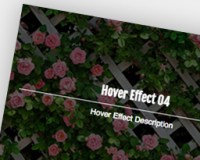
HTML
innerはむだな気がしますが、z-indexを制御する用に設置しています。
html
<div class="bg-scale">
    <div class="inner">
        <p>Background Scale Animation</p>
        <a href="#" class="btn-more">Article</a>
    </div>
</div>
CSS
背景画像をafter擬似要素に指定して重ねることで要素を拡大しても、文字などに影響がないようにします。
あとは「bg-scale」に「overflow: hidden;」を指定すればafterを拡大アニメーションしてもはみ出ないですね。
css
.bg-scale {
	position: relative;
	overflow: hidden;
	text-align: center;
	border-top: solid 1px #596456;
	border-bottom: solid 1px #596456;
	text-shadow: 0 0 12px #7b7a35;
	padding: 60px 0;
}
.bg-scale:after {
	position: absolute;
	content: "";
	display: block;
	width: 100%;
	height: 100%;
	top: 0;
	background: url(bg.jpg) no-repeat center center;
	-webkit-background-size: cover;
	-moz-background-size: cover;
	-ms-background-size: cover;
	background-size: cover;
	-webkit-transition: all .3s ease-out;
	-moz-transition: all .3s ease-out;
    -ms-transition: all .3s ease-out;
	transition: all .3s ease-out;
}
.bg-scale:hover:after {
	opacity: .8;
	-moz-transform: scale(1.2);
	-webkit-transform: scale(1.2);
	-ms-transform: scale(1.2);
	transform: scale(1.2);
}
.bg-scale .inner {
	z-index: 1;
	position: relative;
}